
DOT®
UX / UI
‘connect the dots’
The concept behind Dot was to create a platform that helped people create more meaningful connections with their friends, families, people in their communities and even themselves. In an attempt to solve the problem of social media addiction, Dot was created to emulate elements of social media, without the negative harmful features spread throughout. The app would be categorized under the wellness category, but still maintains features of social media such as messaging, adding friends and creating posts. During the initial stages of creating the concept for Dot, there were many questions that had to be answered, such as how do we encourage real life human interaction, how do we stray away from the generic “followers” terminology, how will users add their connections, do users have to meet in person to create a connection or would that be too complicated. With all that in mind, the primary focus was to eliminate the addictive social currencies such as follower count, likes and comments. After deliberating it was decided that the app didn’t need to be perfect in the sense that it was forcing in person interactions, therefore adding connections was possible through online methods.

Dot has 5 main pages on it’s menu bar, each playing a key role in supporting its mission to create meaningful relationships with others and yourself. The pages on the menu are your entries/profile, events, adding entry, stats and explore.
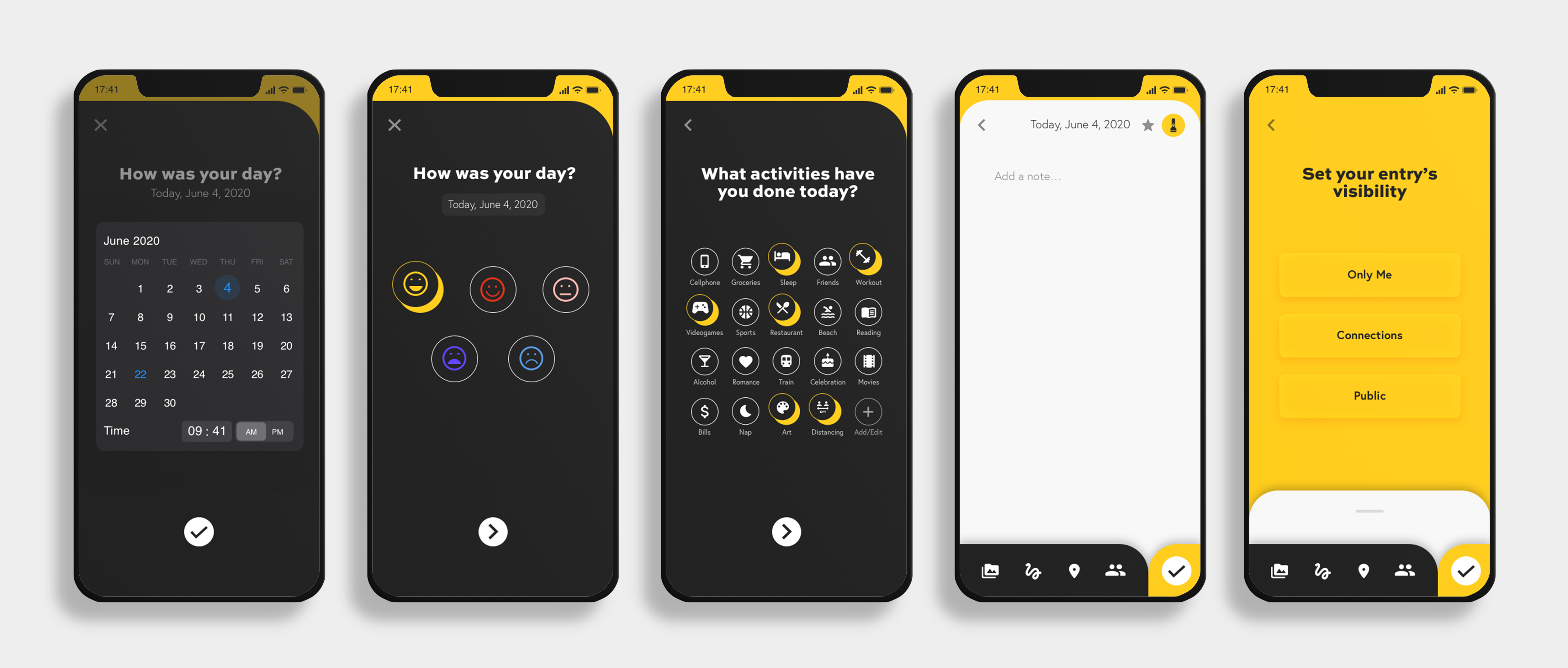
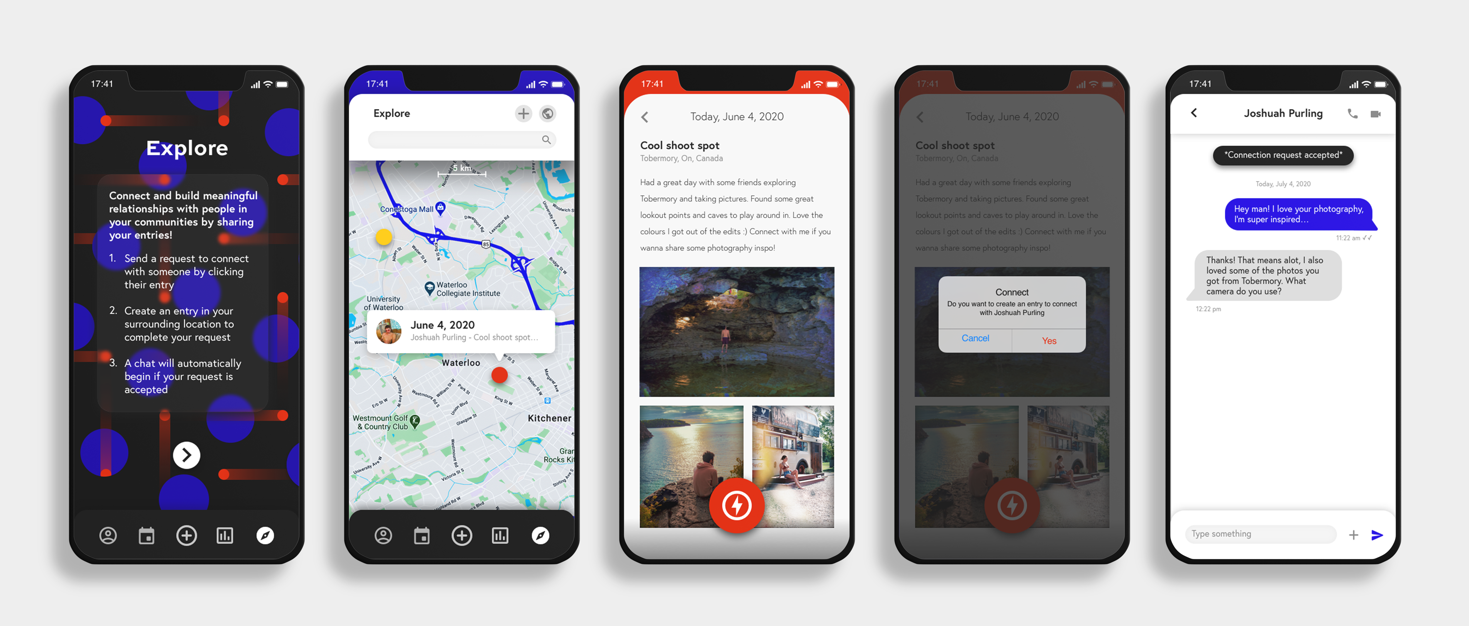
ADDING ENTRY
The first and most important function on the app is the add entry, which is a plus button in the very centre of the menu. With this feature you are able to select your date, your mood, the activities that you’ve done that day and the journal your experience through writing, photos and art. Users can favourite their entries to prioritize them on a list view, they can tag their connections so their friends can see which entries they are a part of and they can also connect their entries to events. When the user decides they are happy with their entry, they can click on the flashlight icon in the top right to reveal the entry’s visibility settings, which are private, only connections or public. This feature allows the user to choose what parts of their lives they want to be private or publicly accessible. Once the user has completed their entry, they are taken to their entries/profile page.
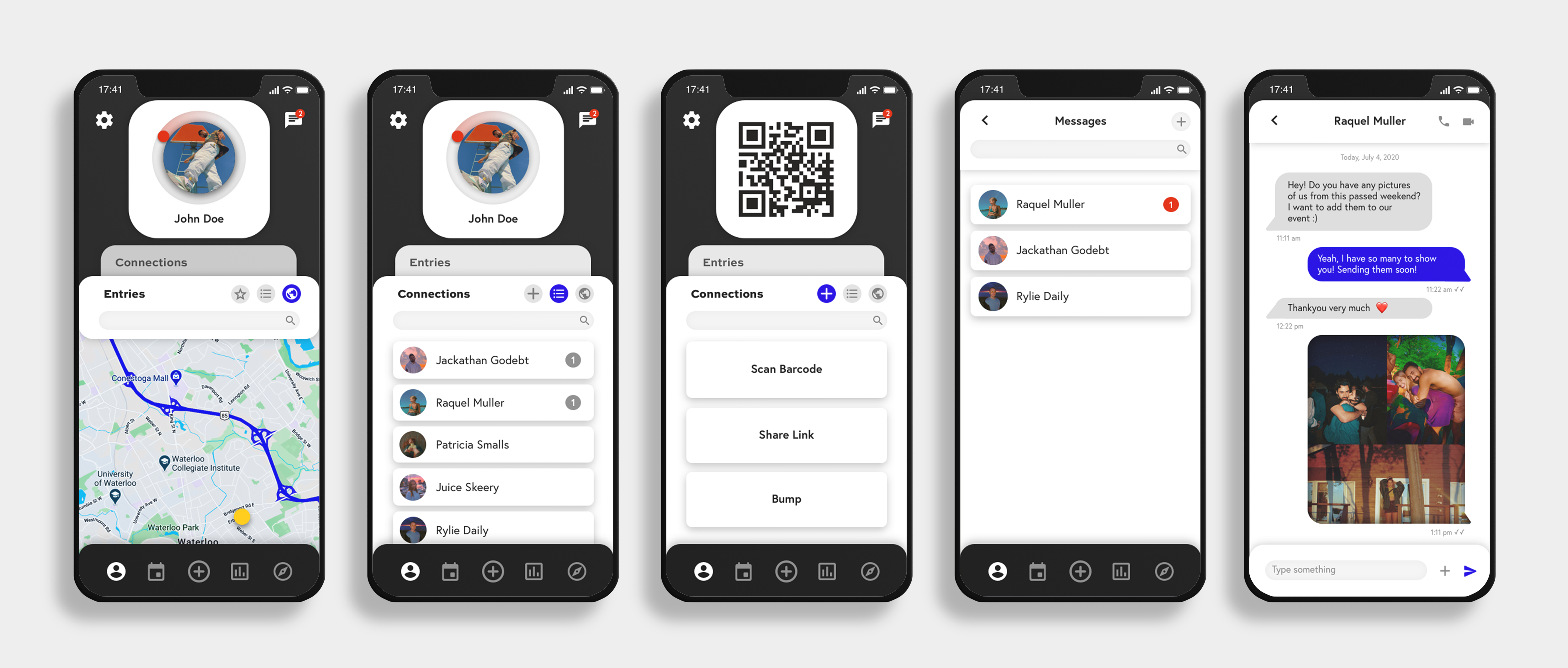
PROFILE PAGE
In the profile page users have access to a multitude of functions some of which are adjusting the filter methods to map view or list view, they can see their messages or even see their connections list. As previously mentioned, there are no “follower” counts in order to stay true to Dot’s brand mission. Users can also click on the menu bar to fill their screen with the function they're trying to access in order to create more space or decrease clutter. The profile page looks very similar to your connections profile page, however instead of being able to view their connections, it’s replaced with a fast link to their direct messages. The whole design of the app is based around the logo and brand imagery which is the red dot and deep blue background. All the ui elements are rounded or inspired by the dot and also contain specific effects such as shadows to make the overall design appear more cohesive. There are also basic functions that the users can utilize such as swiping on their entries to quickly favourite them or even delete them.
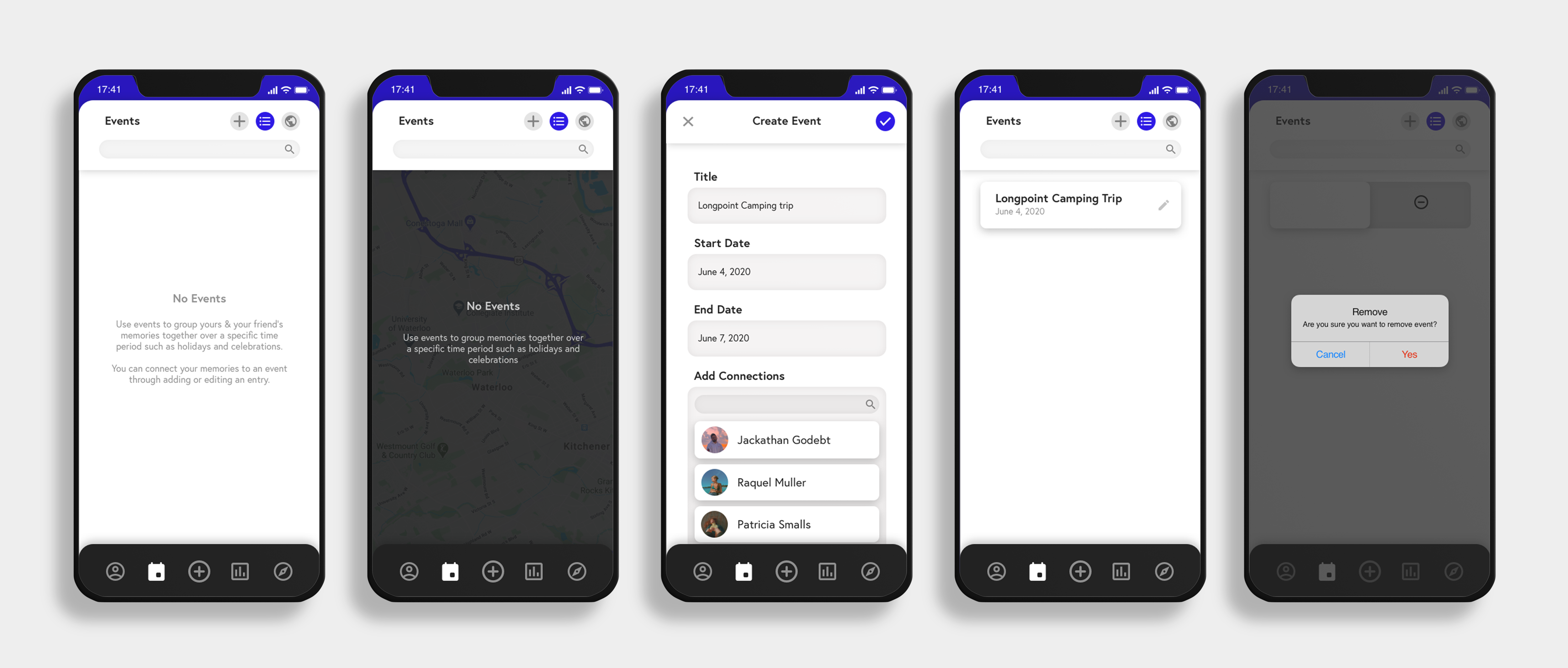
EVENTS PAGE
The next page on the menu is the events, where users can create events with specific time frames and locations to group their entries. Users can add their connections to these events so everyone can contribute and add their own entries. Entries that are added to an event that have connections tagged would automatically set the visibility settings to connections only, that way everyone within the event can view all the memories.
STATS PAGE
The next page on the menu bar is the stats page, where users can connect within themselves and better understand and regulate their own emotions. This feature tracks all of your moods and activities that you’ve entered and then shows the users that information in the form of charts, graphs and stats. For example, if a user wanted to view the common activities that occur when they're in a bad mood, the stats page could show them what kind of habits they've been exhibiting.

EXPLORE PAGE
The last page on the menu bar is one of the most important and unique features that Dot has to offer, which is the explore page. The explore page was created to help users connect with new people in their communities with a focus on subjects that feel meaningful to them. In this page you are able to view your maps with a limit of a 5km radius. In this map users are able to see anyone who’s posted a public entry that they are not already connected with. If the user is interested enough in the post, they have the option of pressing the large lightning bolt button to send a request to connect with the other user. Keeping Dot’s brand mission in mind, in order to create a meaningful connection, the user has to create a public entry before the connection request can be complete. This way the other user has the option to see your entry before they decide whether they would like to accept your connection request. If your connection request has been accepted, you will be instantly notified within your profile’s chat page, where you and the other user will be entered into a conversation.
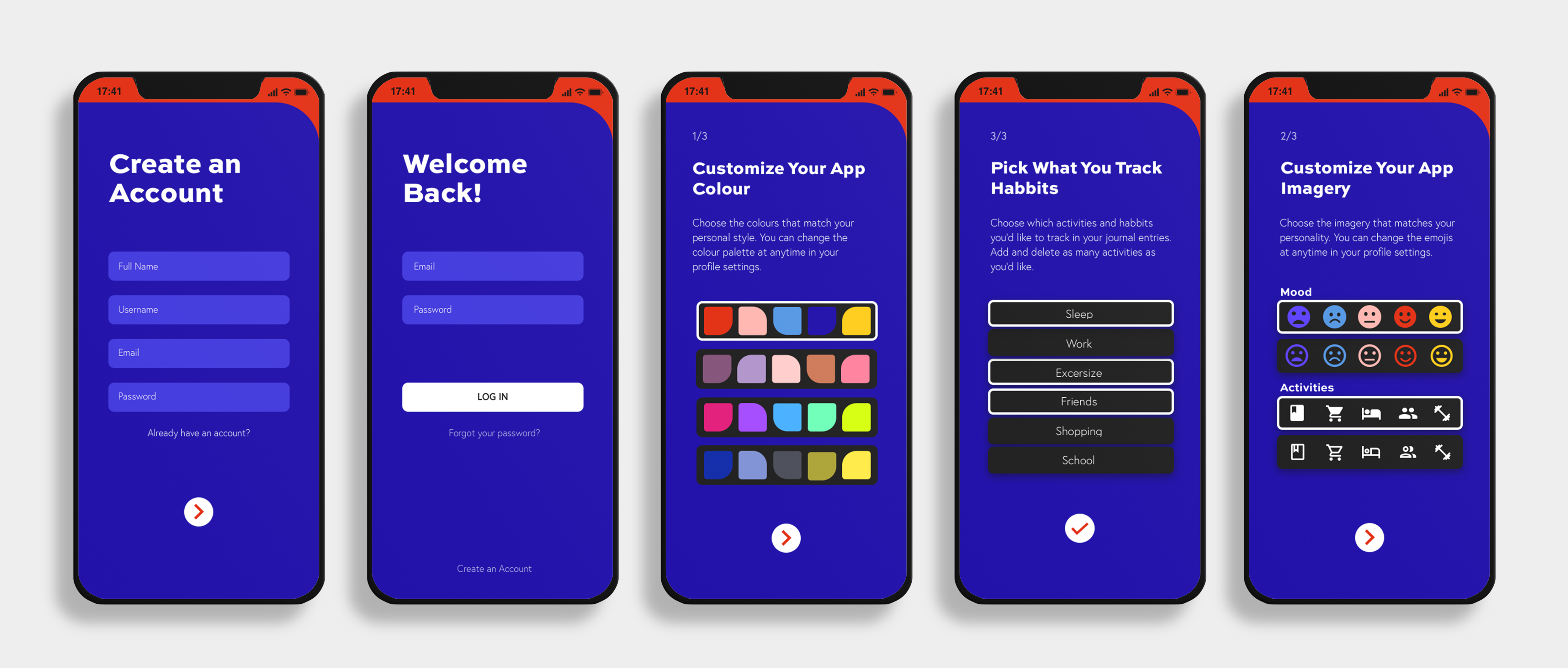
UX
The beginning of the app has a basic on-boarding process where you will be introduced to the app with a simple animation and information about Dot. Through this process you can either create an account or log in to an existing one, where you will not go through the on-boarding process again. If you create an account, you will continue through the onboarding process which has been minimized into as little pages as possible. In this process users will be prompted to create customizations for their app such as choose colour palettes (colour blind option) and imagery that best matches their personality. Users are also notified that they can change and further adjust their apps settings after they have completed the onboarding process. At the top of the screens there is a fraction (⅓, ⅔ ) which indicates how close they are to finishing the onboarding process. Throughout the app there are different design elements such as the red dot, which would be animated to further enhance the brand image and overall aesthetics of the app. The Dot logo is inspired by the dot shape and follows simple shapes to create the D. O. T letter forms.